Dos and Don’ts of Data Visualisation
Highlight your message
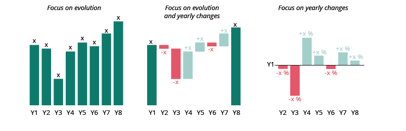
Do highlight what's important, tell one story
Although it is possible to tell one hundred stories using a single line chart, it makes more sense to focus on just one story.
To better convey a message, you need to guide your audience to the data being analysed. The first step is to have a title that focuses on your insight. Then you can graphically highlight your data, keeping other data in the background to give context and allow comparisons.
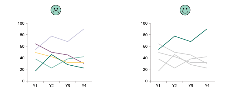
The same can be done in all sorts of charts.
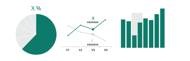
Sometimes you may need to adjust the chart a bit, to let the story emerge.
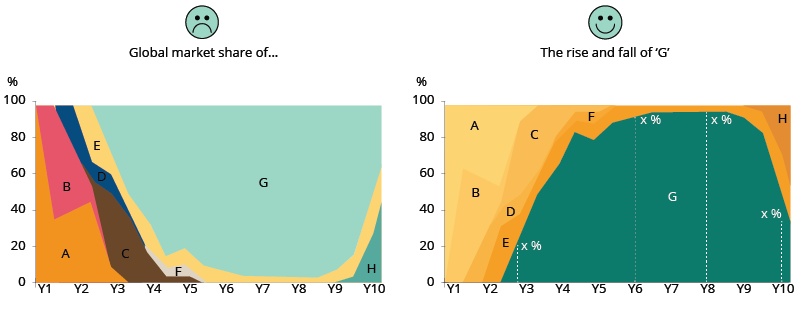
At other times, you might need to opt for a different chart type that better enhances the reader's focus.