
After you perform a series of calculations or gather data, you may need or want to visualize your information so it is easier to make sense of. It is usually easier to make sense of a graph or chart than study a long list of numbers. Visual presentations and summaries can make certain trends or patterns apparent and clear. Long lists of numbers can hide these data trends.

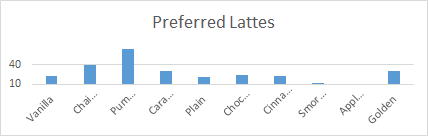
For example, we call this image a bar graph. This one shows the results of a survey your aunt asked the customers at her coffee shop to complete. She wanted to know what flavors she should offer next month to increase her sales, so she asked them to choose their favorite latte flavor. The image is pretty clear, even from a distance: you do not need to sort through a long list of numbers to see that pumpkin spice is the most popular flavor.
We use graphs and charts in almost every field, not just with coffee shop customers. Politicians use them to explain demographics and voting trends in campaigns and elections. Businesses use graphs and charts to show growth trends and areas where they are not doing as well.
It is worth noting that unscrupulous politicians and businesses can, and often do, misuse or distort their performance charts so they display information in a way that supports their interests or goals. For example, suppose a chai tea salesman conducted your aunt's coffee shop survey and used this image to present the data results:
Their presentation significantly reduces the visual gap between pumpkin spice and chai tea lattes. They are trying to convince your aunt to buy more chai tea ingredients, leaving her with less money to buy more pumpkin spice flavoring.
Because charts are so ubiquitous and because they are so easy to manipulate, it is important to know how to read and interpret graphs and charts. Learning this skill will also help you create your own visual presentations. In this unit, we discuss how to use different types of graphs and charts in mathematics. We will interpret the results for each type of graph or chart and learn to create them. We will also explore topics related to long lists of numbers (or data sets), including the measures of central tendency.
Completing this unit should take you approximately 3 hours.
Before we begin constructing graphs and charts, we need to discuss statistics, which we often use to generate graphs and charts. In this unit, we will learn about four important statistical calculations: the mean, median, mode, and range.
Let's say your aunt's second coffee shop is located in a neighborhood where the average or mean household income is $367,500.00. Her accountant advises her to charge more for her drinks and food. People love her shop and can afford to pay more here. However, something unexpected happened when your aunt raised the prices at this location: profits fell!
Your aunt and her accountant were puzzled why far fewer people entered the shop. Then your aunt did some digging. She discovered that 90 of the 100 households in the neighborhood reported earning $75,000.00 annually. Five households said their annual income was $200,000.00, four said $600,000.00, and one household (owned by a wealthy data analyst) reported an annual income of five million dollars! The wealthy households had made the average go up! Ninety out of 100 households in this neighborhood earn well below $300,000.00 per year. Your aunt needs to reduce her prices!
Your aunt's accountant had used a data set that listed all of the household incomes in the neighborhood. The average or mean of this data set did not provide the best information for her purposes. Instead, she should have looked at the median household income. As you will see in the reading materials below, the median of a data set is the middle number, which you can find by writing all the values down in order and circling the one that appears in the middle of your list. For our example, the median value would be $75,000.00!
Read this text. Pay close attention to the "How To" sections which give summaries of how to do mean, median, and mode calculations. After you read the text, complete the practice problems and check your answers.
Watch these three videos to see more worked examples, and see the definition of range in mathematics.
Now that we understand statistical concepts like mean, median, mode, and range, we will begin exploring different types of graphs and charts. As you learn about each type of plot, you should pay careful attention to a few things:
The first type of graph we will explore is called a stem and leaf plot. Watch this video to learn about this type of plot.
Complete this assessment to practice reading stem and leaf plots. Be sure to check your answers.
Now let's explore line graphs. We use these graphs to display trends over time or to show how certain quantities are distributed. For example, a line graph could show the age distribution of students in a class. Here is a line graph version of the bar graph we used to show the flavor of lattes your aunt's customers preferred:

While this line graph displays the exact same information as the original bar graph, organizing the data in this way – placing points over each flavor and then connecting these points with lines – might not be as meaningful or helpful as the original version. It is more common to use line graphs for situations when time is involved.
Consider this example of a line graph that shows the amount of profit your aunt's coffee shops earned during the past year.
The Profit per Month line graph tells an interesting story. Profits fell during the summer but more than rebounded in September. Maybe because the delicious pumpkin-flavored latte was back?
Watch these videos. The first video explains the structure of a line graph using simple examples. The second shows how some presenters manipulate line graphs to misrepresent data.
Complete this assessment to practice making line plots. Be sure to check your answers.
Presenters also use bar graphs to compare amounts or distributions. You are familiar with the one we used above to display the latte preferences of your aunt's customers.
Watch this video so you are familiar with other types of bar graphs and how to create them.
Complete this assessment to practice reading bar graphs. Be sure to check your answers.
Complete this assessment to practice creating bar graphs. Be sure to check your answers.
These videos show examples of how box-and-whisker plots are used, and examples of how to construct them.
Complete this assessment to practice creating box and whisker plots. Be sure to check your answers.
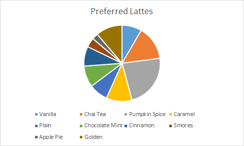
The circle or pie graph is another graph we can use to display distributions of data. For example, we can generate a pie graph of our original preferred lattes bar graph. The size of each slice of the pie corresponds to the number of customers who prefer each type of flavored coffee.
Watch this video to learn how to construct and use pie charts in a variety of settings.
Pictographs are the last type of graph we discuss here. These use symbols to represent numbers of objects or people in a graph. In pictographs, it is important to read the key, or legend, to understand the meaning of the symbols.
Watch this video for an example of how to interpret a pictograph.
Complete this assessment to practice reading pictographs. Be sure to check your answers.