Whether on purpose or not, a statistician can mislead an audience with a chart. This article explains some chart design principles and common mistakes novice data analysts make. Think about the statistical charts you have seen on billboards, in the news, and in research studies. Using these principles as a guide, would you classify any of those charts as misleading? Be sure to take note of the suggestions for successful dashboards.
If you are publishing a visualisation on the website, you may opt for a static or an interactive chart. The first variable that influences the choice is the target audience.
Static charts are often an adequate option because they are easy to access and do not come with the risk of display issues on your browser or other apps.
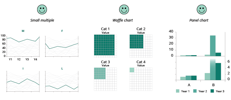
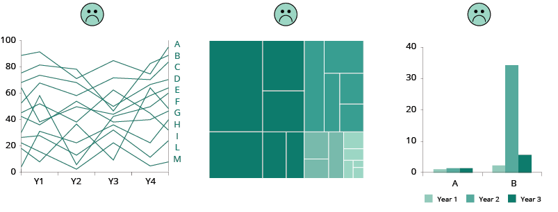
But sometimes it is strongly recommended to use the interactive version when:
If the visualisation is for a PDF publication or a PowerPoint slide and you need to produce a static chart, you may consider presenting your data in a different way to avoid the issues mentioned above.